Last November I started in on a rebuild of an Admin area for a client. They sent me the PSDs of all the views and I started taking notes on what needed to be built out so I could plan my dev time. I noticed that aside from the main index view, the designer had done an excellent job of creating a language for the site and just modifying it according to the content demands of each view.
This meant that there was one recurring box container that showed up on most every view, and as I took notes of where it was and what it looked like, I soon realized there were three major variations of the box.
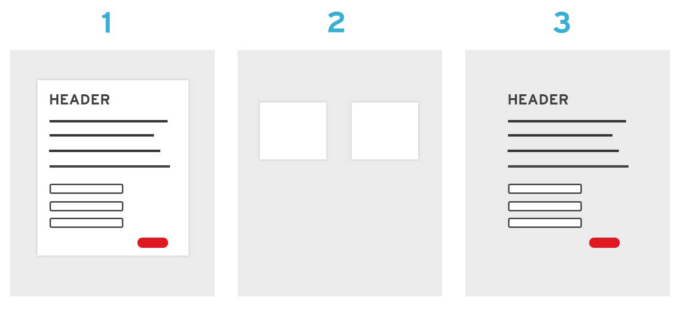
The first was the most common - a white box with a slight drop shadow, centered within its parent element. The second happened on the login screen - same design but there were two boxes requiring different positioning than centering. The third option had all the same inner-content styles, but it lacked the background or drop-shadow.
The other constraint was that the designer wisely chose to size the boxes according to content instead of just fitting the content into the same box across views, so I needed to be able to define the width of the box on each individual view.
I learned CSS with an object-oriented CSS model and that served me well while writing vanilla CSS, but I use Sass now and I find that OOCSS principles don’t always apply. In this case, it would have required creating a base .box case and then adding classes on top of it to get different behaviors. I personally despise markup like this, as the cognitive load required to remember every box variation quickly becomes untenable on large projects.
With Sass this becomes much more managable because I can write clean html that is only concerned with the content and then define all of the layout variations within my stylesheets - separating the content from the design in a way that I find much easier to manage. Here’s how I solved it on this project.
First of all, since I was using Sass, I was using a manifest file and including multiple smaller Sass files to keep things neat and organized, like so:
@import "mixins";
@import "base";
@import "icons";
@import "index";
I was using this across multiple views and it didn’t make sense for me to output the code without context, so I made it a mixin. I’ll show you the mixin, then explain the code.
@mixin site-box($width, $bgColor, $center: true) {
  display: block;
  padding: 2.5em;
  position: relative;
  width: $width;

  // Center by default, otherwise float left
  @if $center {
    margin: 0 auto;
  } @else {
  float: left;
  }

  // if a background color is passed in, a drop shadow is added as well
  @if $bgColor {
    background-color: $bgColor;
    box-shadow: 0px 0px 2px 2px rgba(0,0,0,.1);
  }
}
If I had an element on a view named .account-update that needed to be the box, I could easily include this mixin with just a few arguments. First, I’d consult the design to see how wide it needed to be for my first argument. Then, if it had a bg, I’d pass in the desired color. Because I knew the needs of the site, I knew that a drop shadow was only necessary if there was a background color so I included an @if statement that handled adding both the background color and the drop shadow. And then last of all, the box defaults to centered with $center: true, but in cases where I needed alternate positioning I could easily pass in a third argument to override the default.
In my stylesheets, if I wanted to use the mixin it would look like this to get a 400px wide box with a bg and drop shadow:
.account-update {
    @include site-box(400px, $white);
 }
Or in the case where I was floating the box to the left beside some other element, I could call it like this:
.login-form {
    @include site-box(300px, $white, false);
    left: 300px;
 }
There you have it, a simple example of using Sass mixins to help your CSS handle variations a bit more easily.
A few notes
This was not a responsive site. This strategy would still work, but the mixin would obviously be a lot more complicated as you’d have to deal with breakpoints and such.
I have no idea how this scales on super large sites. This site was a complicated web app, but it thankfully didn’t have many views so the variations involved were minimal.
Thanks for reading! I’m @suchwinston on Twitter, I’d love to hear your feedback or comments or whatnot there.